Trend Card
Trend Card
A trend card displays a trend of one or more metrics. The most common use case for this pattern is in a dashboard. For a single trend card, there are two different sizes of cards to choose from dependent on your application’s needs.
Jump to Small Cards or Large Cards
Small Cards
Large Cards
Trend Card
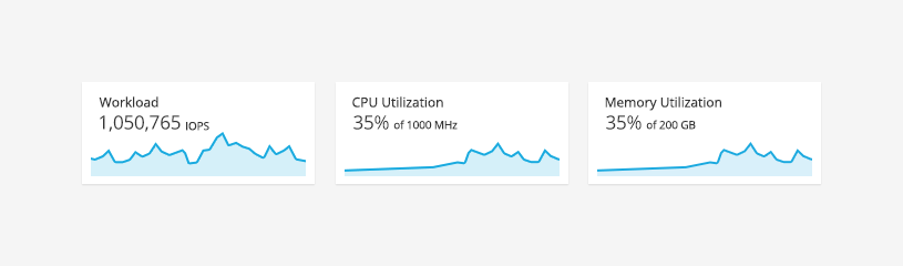
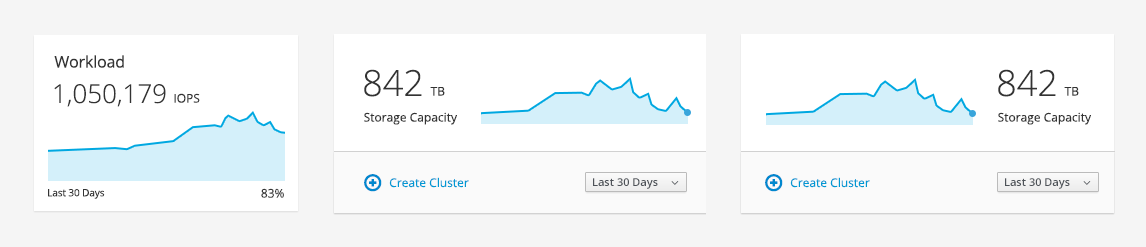
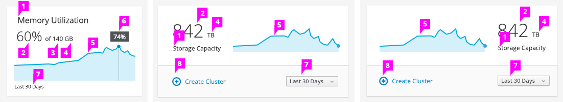
Card with a Single Trend
-
Title: Identify a name for the trend being displayed. If the title does not require much emphasis and the trend is on the right, you may opt to place the title under the actual value versus the top left of the card.
-
Actual Value or Percentage: Shows the current value or percentage. The position may vary dependent on usage. Placement options for the actual value include:
-
Above the sparkline
-
Left of the sparkline
-
Right of the sparkline
-
-
Total Value (optional): If needed, provide total value next to the actual value to help provide context.
-
Unit of Measurement: The label for unit of measurement is shown after the the value.
-
Sparkline: See the Sparkline pattern for more details.
-
Tooltip: Use a tooltip on hover to display additional information about exact points on the sparkline (e.g. values and/or percentages). A vertical line and marker helps to accentuate the hover point.
-
Time Frame (optional): The time frame on a card is optional since there could be a single instance of the time frame label or time frame filter that applies to all cards within a single view. The time frame is indicated by placing a label on one of the following areas:
-
Under the title
-
Under the sparkline
-
In a Time Frame Filter
-
-
Actions Panel (optional): See Actions Panel under the Cards pattern for more details.
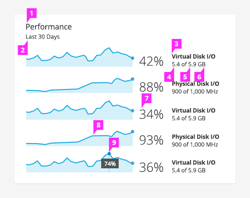
Card with Multiple Trends
-
Title: Identify the name of the group or category of the trends being displayed. For a card with multiple trends, the title is always located at the top left.
-
Time Frame: The time frame is located under the title in a card with multiple trends.
-
Trend Label: Since there are multiple trends, each trend should be labeled.
-
Actual Value: Shows the current value to the right of the sparkline.
-
Total Value (optional): If needed, provide total value next to the actual value to help provide context.
-
Unit of Measurement: The label for unit of measurement is shown after the the value.
-
Percentage (optional): The location of the percentage can be shown to the right of the sparkline.
-
Sparkline: See the Sparkline pattern for more details.
-
Tooltip: Use a tooltip on hover to display additional information about exact points on the sparkline such as values or percentages. A vertical line and marker helps to accentuate the user’s hover point.
- View Angular PatternFly Example
- View PatternFly NG Example
- View PatternFly React Example
PatternFly Core Example Not Available
There is no PatternFly-Core code available for this pattern at this time. Links to the JS framework implementations can be seen above.
Visit the Contributing to PatternFly documentation to learn how to contribute the code.