Canvas View
Canvas View
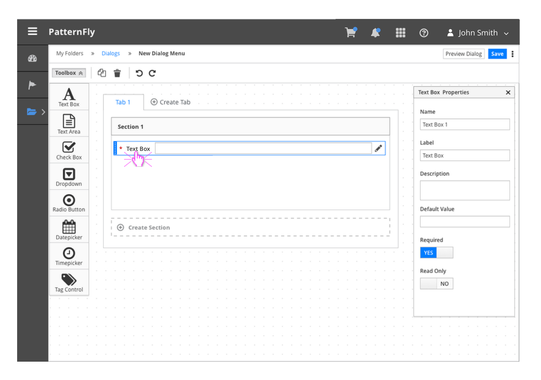
The Canvas View allows users to create and edit content on a canvas. The editable area, or canvas, is positioned in the center of the page, while all corresponding panels and toolbars surround the canvas. Users can drag items from the toolbox onto the canvas and arrange the items as needed. Follow the Drag and Drop framework for specifics on the interaction.
The canvas can be viewed as a single receptacle onto which toolbox items can be dragged anywhere. In some cases, there may be container objects on the canvas into which toolbox items can be dragged.
In some cases, items on the canvas can be ordered or connected to represent a particular flow or interaction. All tools associated with the items can be found above the canvas in the Editor Toolbar.
Layout
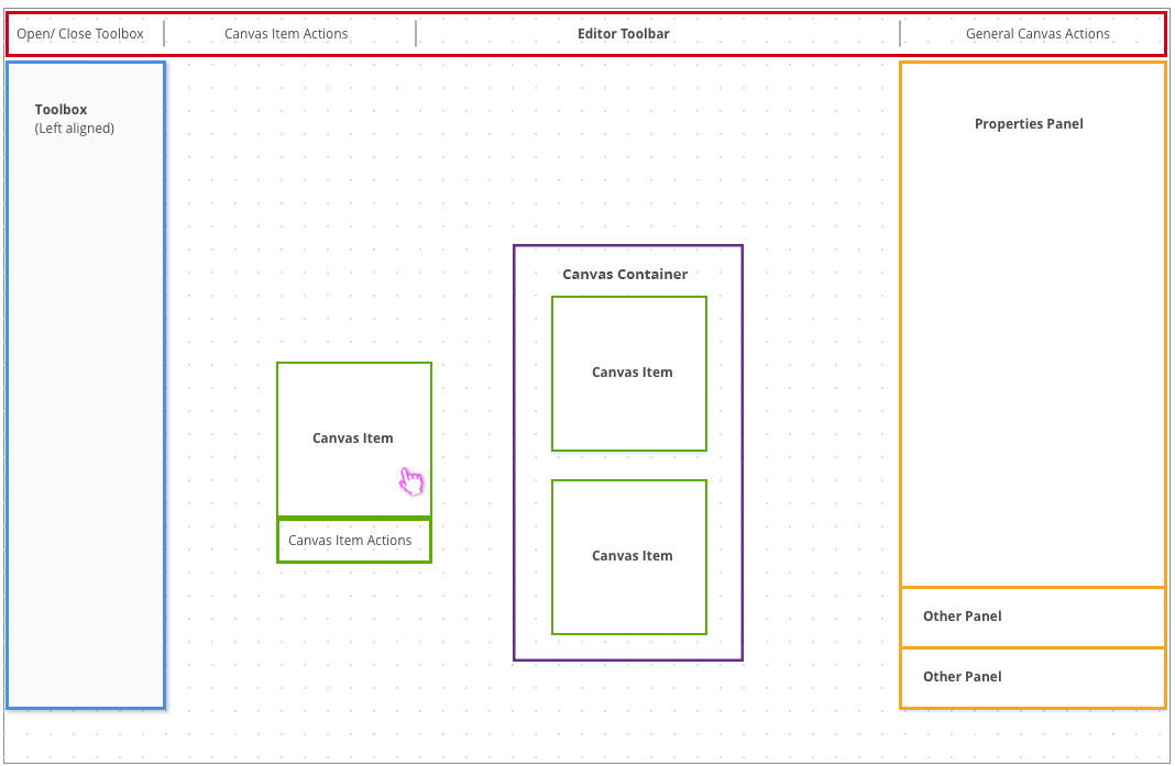
Example with Left-aligned Toolbox
The Canvas View is typically embedded into a page that has breadcrumbs and some navigation framework.
Canvas View
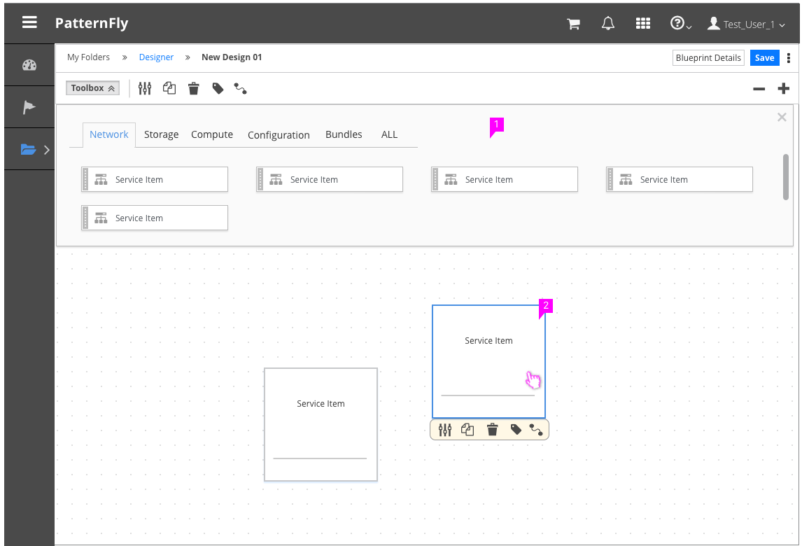
- Editor Toolbar: The Editor Toolbar includes a mechanism to open and close the toolbox as well as actions pertaining to the items on the canvas. The Toolbar can also optionally include zoom/pan actions, find, and view types.
- Canvas: A grid based background should cover the working area of the Canvas View. Users can drag items from the toolbox onto the canvas and arrange the items as needed.
- Toolbox:
- All items that can be dragged onto the canvas are available in the toolbox.
- The toolbox can be left-aligned or top-aligned depending on the use case.
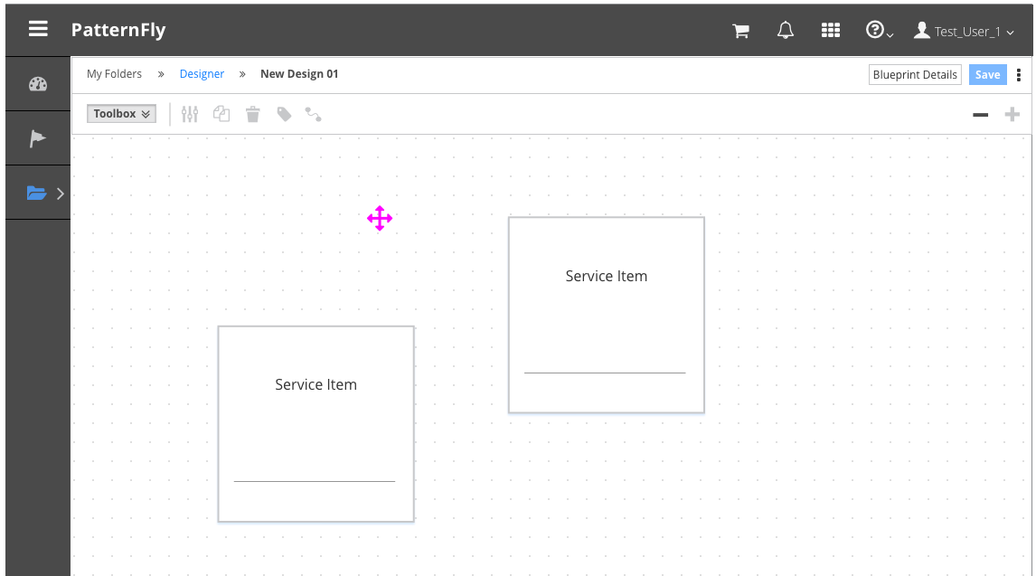
- Canvas Items: Canvas items are things that have been dragged from the toolbox onto the canvas. In some cases items can be ordered or connected to represent a particular flow of information.
- Properties Panel (optional):
- Users may need to view or edit the properties of individual canvas items.
- When a user selects an item to view the properties, a panel should appear on the right side of the canvas.
- It should be clear which item properties are being displayed and users should have the ability to hide or collapse the properties panel as needed.
Example of Left-aligned Toolbox with Fly-out Menus
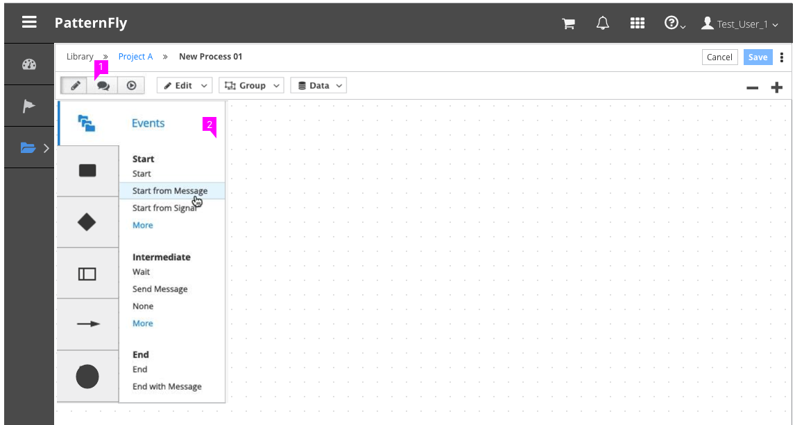
- Toolbar: If more than one type of toolbox must exist, a button group may be used in the Editor Toolbar to open and close one toolbox at a time.
- Toolbox: With left-aligned toolboxes, fly-out menus can be used as needed for scalability.
Example of Top-aligned Toolbox
- Toolbox: With top-aligned toolboxes, tabs and scroll capability can be used as needed for scalability.
- Canvas Items: When a user clicks on a canvas item, the selected state should be visually indicated. For cases where multiple actions are available, a contextual menu of canvas item actions is recommended on hover.
Zooming and Panning on the Canvas
Implementing the pan and zoom functionality is optional, but is recommended for any Canvas View that has the potential for becoming overcrowded with canvas items.
Zooming
- The fa-minus and fa-plus icons should be used as the action buttons for zooming in and out of the canvas.
- The default zoom level will be considered 100% zoom. The + button is disabled at this zoom level.
- Clicking the fa-minus button once will cause the canvas to transition to 75% of the original zoom level.
- Zooming out a second time will redraw the canvas at 50% of the original size. This will be the most zoomed-out state of the canvas.
Panning
- Clicking and dragging on the canvas background when the cursor is in the all-scroll state will pan the canvas.
- When the canvas is not zoomed out all the way, hovering over the canvas background will change the mouse pointer to “cursor:all-scroll”.
- When the canvas is zoomed out all the way, the cursor property will be set to “cursor: default”.
Canvas Containers
Containers are optional elements that contain, or nest, certain toolbox elements. They are not toolbox elements themselves and have their own properties.
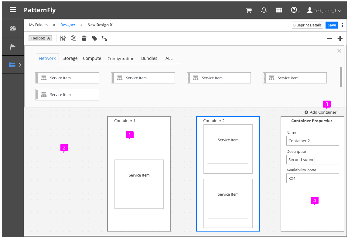
- Containers:
- When a user clicks on a container, the selected state is visually indicated.
- When a container is selected, container actions are shown on the Editor Toolbar.
- For cases where multiple actions are available, a contextual menu of container actions is recommended on hover.
- Like canvas items, containers can be ordered or connected to represent a particular flow of information.
- Container-Only Toolbox Elements: Some toolbox elements can only be added to containers. When such an element is selected in the toolbox and dragged onto the canvas area outside of a container, the item cannot be dropped. This is indicated visually by changing the appearance of the cursor to a circle-slash (fa-ban icon).
- Adding Containers: A control is placed on the canvas for adding new containers. This control should always be “on top” so that elements dragged onto the canvas cannot hide the control. Once a container has been added to the canvas, it can be clicked and dragged around the canvas just like toolbox elements.
- Properties Panel (optional): As with canvas items, when a container is selected, an optional properties panel will appear on the right side of the canvas.
- View Angular PatternFly Example
- View PatternFly NG Example
- View PatternFly React Example
PatternFly Core Example Not Available
There is no PatternFly-Core code available for this pattern at this time. Links to the JS framework implementations can be seen above.
Visit the Contributing to PatternFly documentation to learn how to contribute the code.