File Upload
File Upload
Overview
The file upload pattern allows users to upload single or multiple files. The single file upload component can have either a read-only preview or an editable preview of the uploaded file. Multiple file upload does not have a preview.
This pattern has two main ways to interact with it: browsing for a file within a file directory or dragging and dropping a file. The editable preview version supports the additional interaction of typing or pasting text directly into the drag and drop area.
Multiple File Upload
Single File Upload
Read-Only Preview
Editable Preview
Use Cases
This pattern should not be used when the file select component provided by the browser will provide a smooth interaction for users of the product. We do recommend using this pattern in the following use cases:
- In situations where it is likely that the user would have the file handy from a recent download or interaction for dragging into the browser.
- When the user may need to upload multiple files, as the drag and drop will allow for a faster interaction than selecting multiple files through browsing.
- When a preview of the file is necessary to help confirm the content is correct.
- When a user might be adding a file into an text editing environment.
File Upload
Patterns Available:
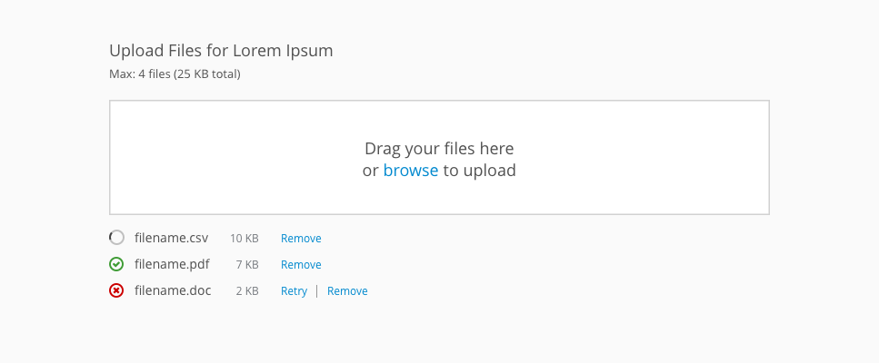
Multiple File Upload
Use this component when you need to upload one or more files without previewing the contents of the file.
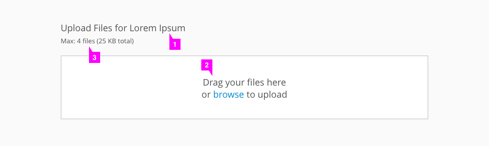
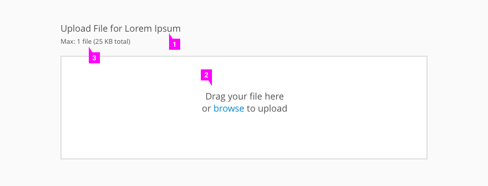
- Header (optional): Optionally use a title to give users context around the drag and drop component.
- Drag and drop area: Users may drag and drop files anywhere in this box or click “browse” to open a file directory and search for files.
- Max files and size (optional): Indicates to the user how many files they may upload and how large the upload may be.
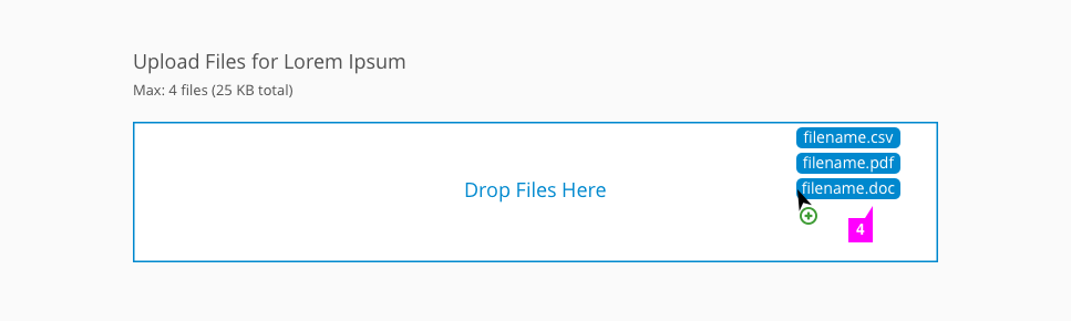
- Hover state: Upon dragging files over the drop area, the drag and drop area becomes outlined in blue and the text changes to “Drop Files Here.” The pficon-add-circle-o icon is shown beneath the cursor.
- Upload status: After the files have been dropped, their upload status is shown.
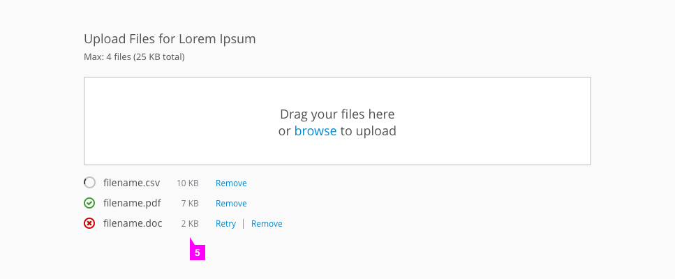
- Success: For files that have successfully uploaded, the pficon-ok icon will be shown to the left of the filename and the file size is listed to the right (optional). Users have the option to remove the file by selecting “Remove.”
- Failure: For unsuccessful uploads, the pficon-error-circle-o icon is used instead. Users have the option to select “Retry” or “Remove.”
- Loading: The Patternfly spinner and text indicate the current status of each file uploading.
- Note: If a selected file does not match the requirements for the file upload, an error dialog will appear to inform the user that the file is unable to be uploaded. This includes instances where the user has attempted to upload a file of the wrong type or more files than allowed, for example.
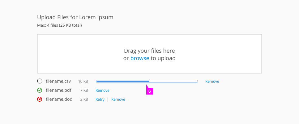
- Loading bars (optional): If files may take a while to upload and upload times can be determined, a loading bar can be shown to give the user better feedback on upload times.
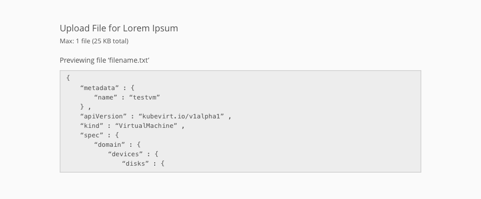
Single File Upload
Read-Only Preview
Use this component when you need to upload one file with a read-only preview.
- Header (optional): Optionally use a title to give users context around the drag and drop component.
- Drag and drop area: Users may drag and drop files anywhere in this box or click “browse” to open a file directory and search for files.
- Max files and size (optional): Indicates to the user how many files they may upload and how large the upload may be.
- Filename: After the file has successfully uploaded, the filename is shown. Users have the option to remove the file by selecting “Remove.”
- Preview box: After the file has successfully uploaded, the drag and drop area becomes the preview box.
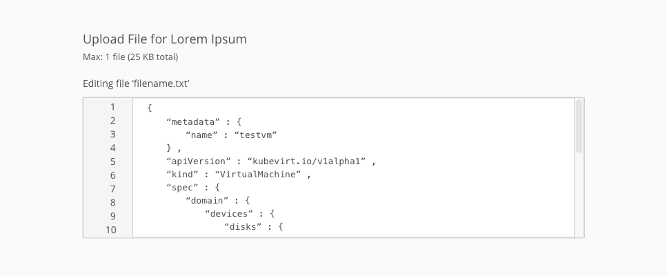
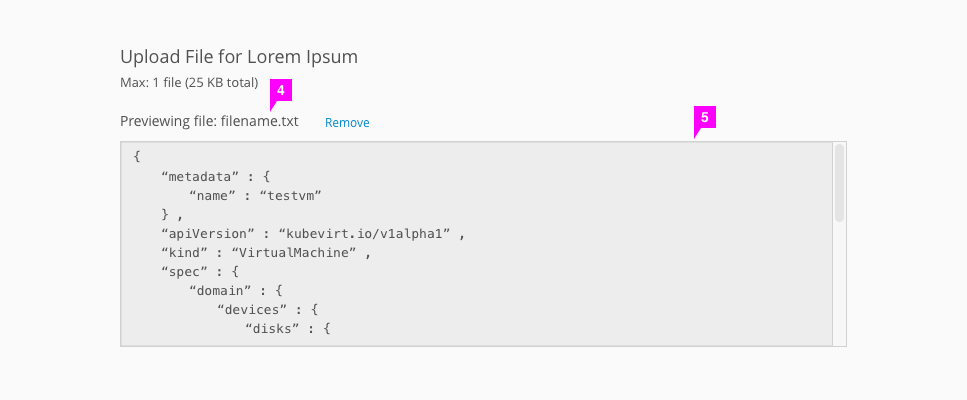
Editable Preview
Use this component when you need to upload one file with an editable preview.
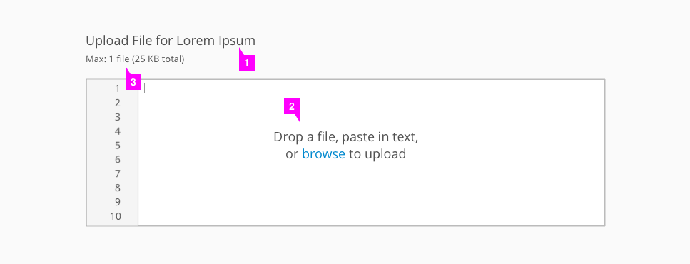
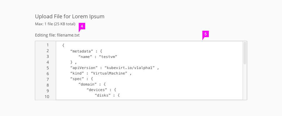
- Header (optional): Optionally use a title to give users context around the drag and drop component.
- Drag and drop area: Users may drag and drop a file anywhere in this box, click “browse” to open a file directory and search for files, or type or paste text directly into the box.
- Max files and size (optional): Indicates to the user how many files they may upload and how large the upload may be.
- Filename (optional): After the file has successfully uploaded, the filename is shown. This is only shown if a user chose to upload a file via drag and drop or using the “browse” link.
- Edit box: After the file has successfully uploaded or the user has copied and pasted into the box, the edit box is populated with content and the empty state disappears. Users may edit the content by typing directly into the box.
- If a user deletes the contents of the edit box, it will return to the original drag and drop state.
- View Angular PatternFly Example
- View PatternFly NG Example
- View PatternFly React Example
PatternFly Core Example Not Available
There is no PatternFly-Core code available for this pattern at this time. Links to the JS framework implementations can be seen above.
Visit the Contributing to PatternFly documentation to learn how to contribute the code.